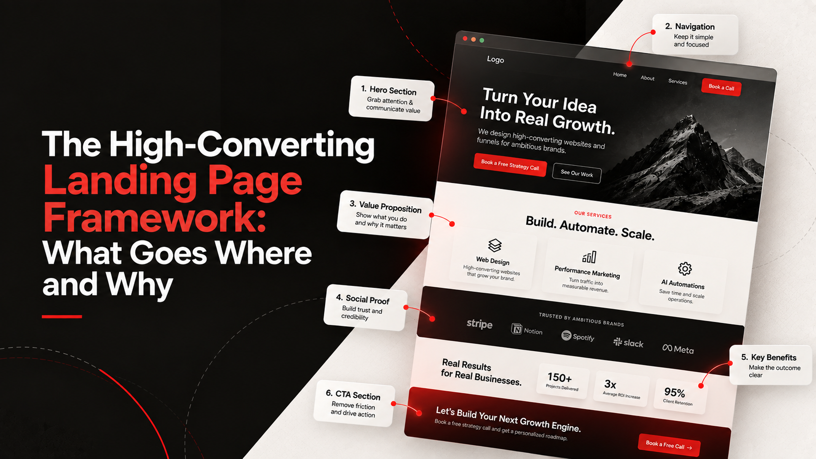
The High-Converting Landing Page Framework: What Goes Where and Why
Most landing pages are a chaotic mess of competing priorities. They try to tell the company's entire history, list every minor feature, and beg the user to "subscribe to our newsletter" while simultaneously trying to sell a $5,000 service.
If you confuse people, you lose people.
A high-converting landing page is not a digital brochure. It is a highly engineered sales argument. Every single pixel, heading, and button has one job: moving the visitor toward a specific, meaningful action.
At SilverPlexus, we use a very specific architecture for lead generation landing pages. Here is the framework, section by section.
1. The Hero Section (Above the Fold)
This is the most critical real estate on the internet. You have roughly three seconds to convince a visitor not to hit the back button.
The Headline: This needs to state the core value proposition instantly. Forget clever puns. Be aggressively clear about the outcome you deliver.
The Subheadline: Expand on the headline. Explain how you deliver that outcome and who it is for.
The Call to Action (CTA): One button. High contrast. Action-oriented text (e.g., "Get Your Free Audit" instead of "Submit").
Social Proof: A tiny banner under the CTA saying "Trusted by 500+ teams" or a 5-star rating graphic immediately reduces anxiety.
2. The Agitation Section (The Problem)
People don't buy products; they buy solutions to problems. Before you introduce your brilliant solution, you need to remind them how much their current situation hurts.
Call out their customer objections and pain points explicitly. Use language like, "Are you tired of manually syncing data between spreadsheets?" When they feel understood, they trust you to solve the issue.
3. The Solution & Features (The "How")
Now you introduce your service. But remember: keep it tied to outcomes.
Don't just list technical specifications. Use a simple 3-column layout to highlight the top three benefits of working with you. Pair every feature with the direct benefit it provides the user.
4. Unshakable Social Proof
You can say you're great all day, but your customers saying it carries 10x the weight. Include:
Real testimonials with headshots and full names.
Logos of recognizable companies you have worked with.
Quantifiable case studies ("How we increased revenue by 40%").
5. The Final Push (Bottom CTA)
By the time they reach the bottom of the page, they are either going to convert or leave. Don't make them scroll all the way back to the top. Reiterate your value proposition one last time and provide a massive, unmissable CTA section.
Remove all friction. If you're using a form, ask for the absolute minimum amount of information required to qualify the lead. Every extra form field cuts your conversion rate.
If your landing page is built this way and it still isn't converting, the page isn't the issue—your offer is. (If you want to diagnose further, check out our Practical Website Conversion Audit).

Mahima Mujral
Co-founder & Strategy Lead
Mahima is a specialist in landing pages and sales funnels. She builds the narratives that convert attention into revenue, ensuring that every piece of infrastructure actually speaks to the buyer's real, unspoken needs.
Frequently Asked Questions
Looking for personalized project roadmap?
Book a call & let's discuss this out


Keep Reading
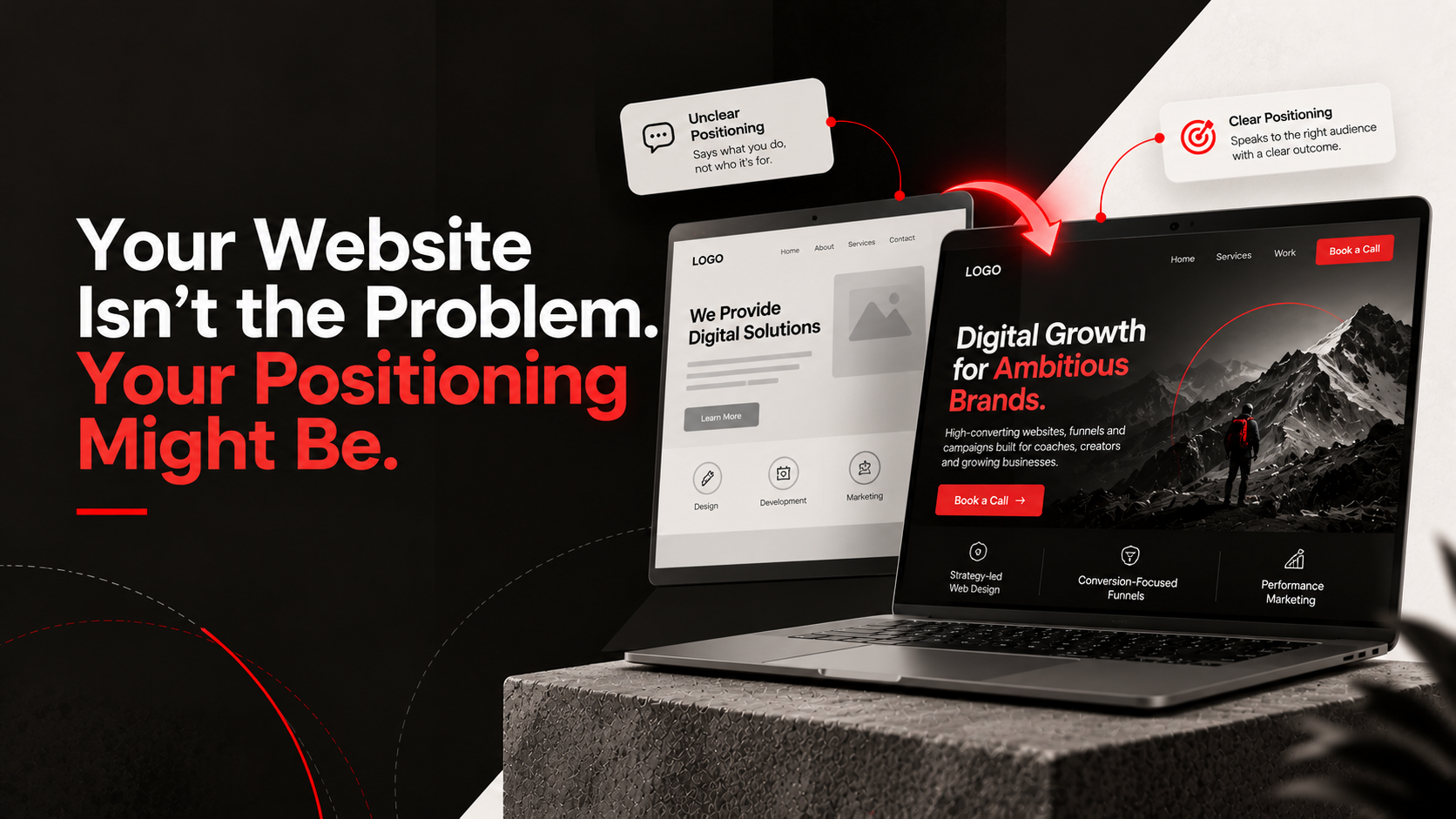
Your Website Isn't the Problem. Your Positioning Might Be.
A beautiful website won't save a confusing brand. Learn why your positioning, messaging, and value proposition matter more than aesthetics.
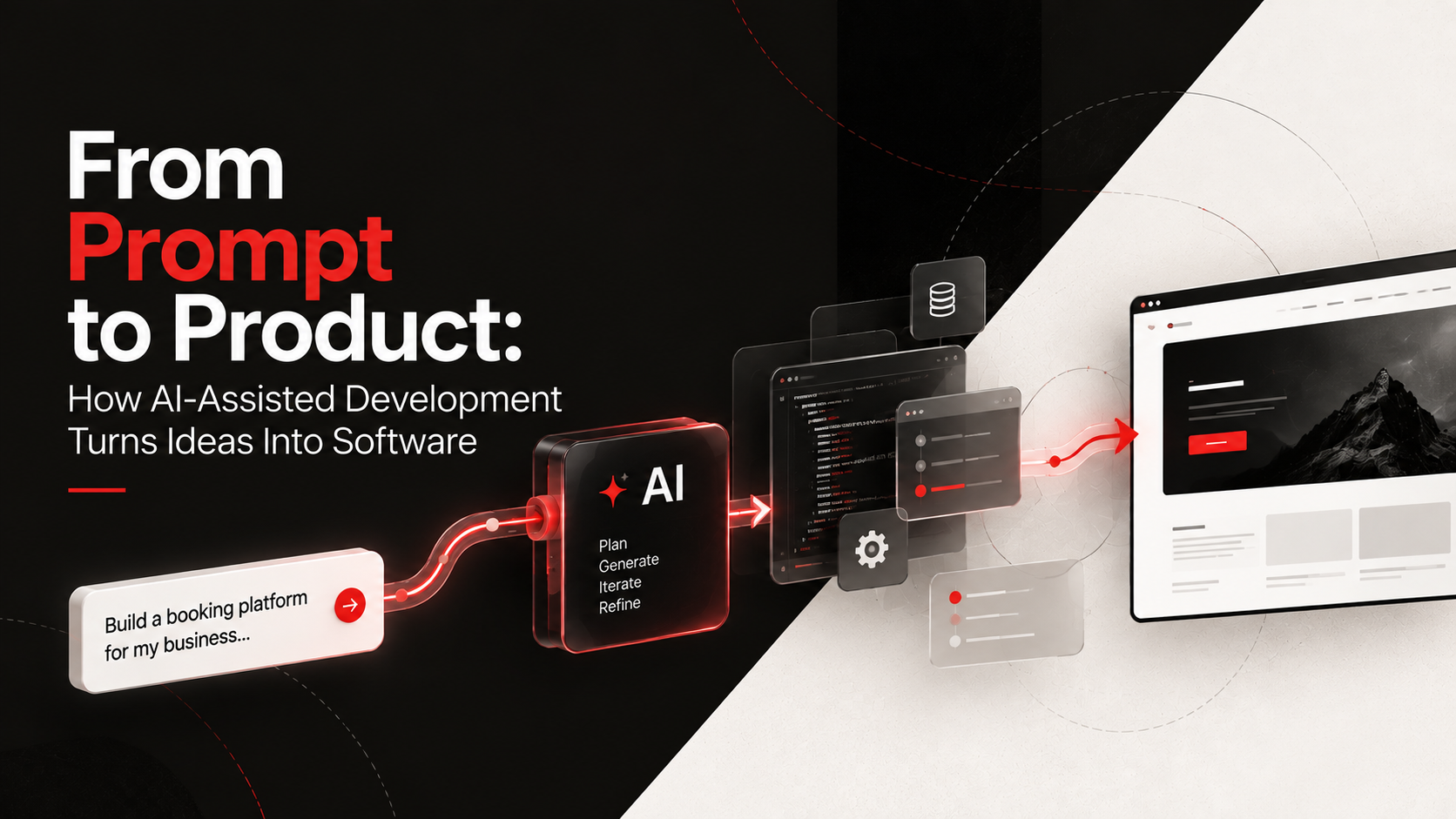
From Prompt to Product: How AI-Assisted Development Turns Ideas Into Software
Learn how modern developers use AI-assisted coding and vibe coding to turn ideas into fully functional software at record speed.
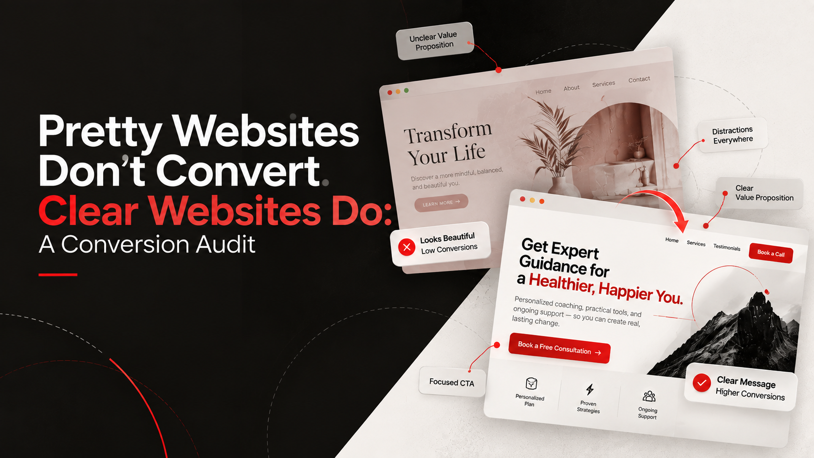
Pretty Websites Don't Convert. Clear Websites Do: A Conversion Audit
Before you spend thousands on a website redesign, run this practical website conversion audit to identify and fix hidden friction points.
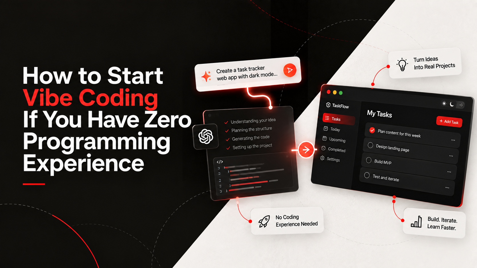
How to Start Vibe Coding If You Have Zero Programming Experience
Want to build apps but don't know how to code? Discover how beginners are using AI assistants and vibe coding to build their first projects.
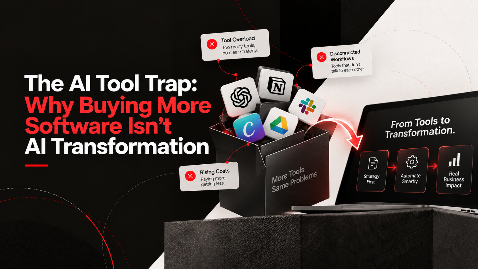
The AI Tool Trap: Why Buying More Software Isn't AI Transformation
Stop buying AI subscriptions you don't need. Learn why real business process automation starts with strategy, not just more software.