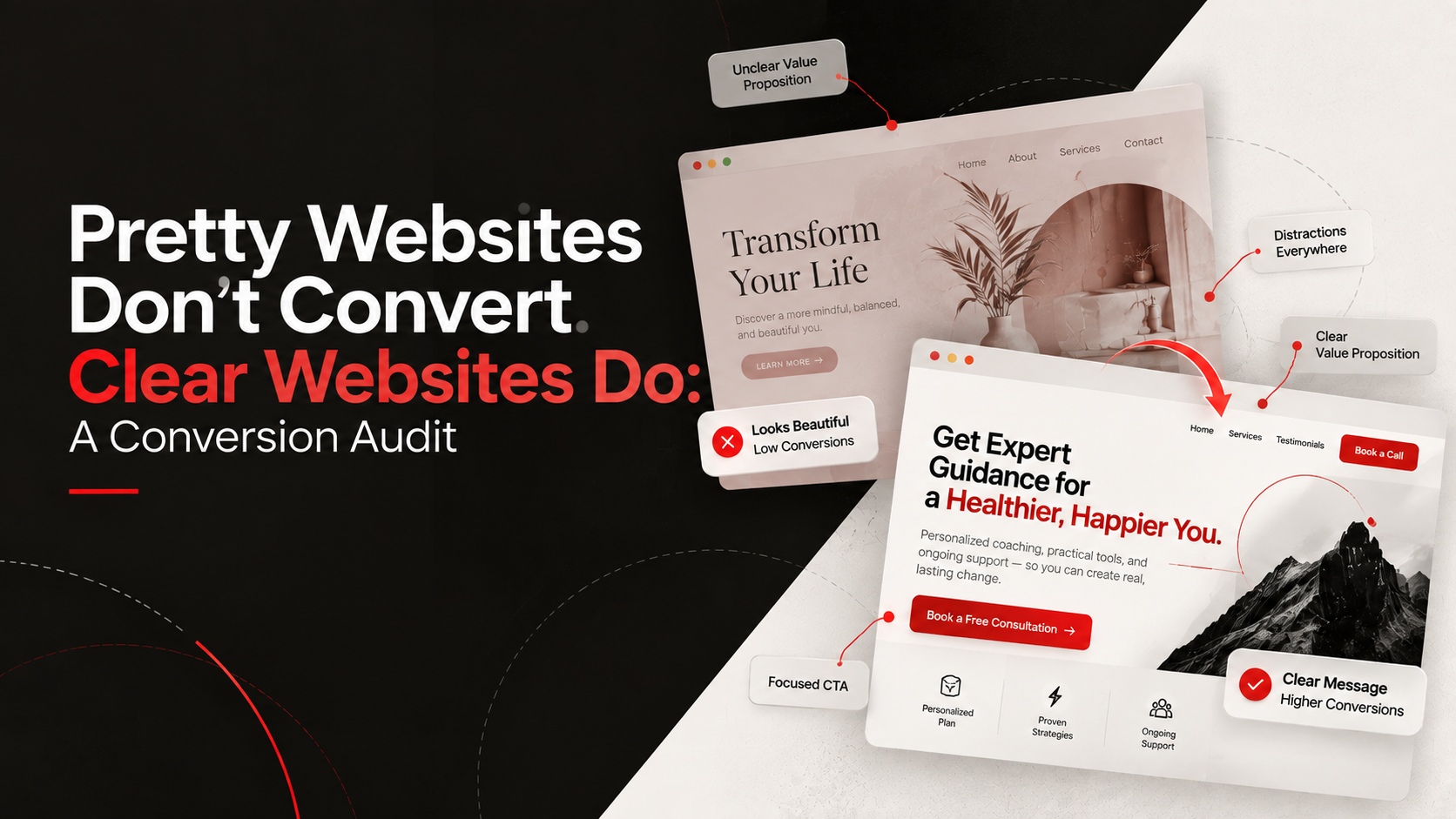
Pretty Websites Don't Convert. Clear Websites Do: A Conversion Audit
There is a dangerous myth in the tech world that beautiful aesthetics automatically equal high revenue.
We see founders obsessing over font pairings, drop shadows, and complex WebGL background animations. Meanwhile, their "Book a Demo" button is buried three clicks deep, and their site takes six seconds to load on a mobile connection.
Pretty doesn't pay the bills. Clarity does.
Before you burn your budget on a complete website redesign, you need to diagnose where your current user journey is bleeding out. Here is the practical website conversion audit framework we use at SilverPlexus.
1. The Clarity and Usability Check
Can a total stranger figure out what you do without scrolling?
Ask a friend (who doesn't work in your industry) to look at your homepage for five seconds, then close their laptop and explain your business. If they can't do it, your website usability is failing at step one.
Audit Action: Ensure your headline is literal. Kill the clever jargon. Make sure your primary website navigation is brutally simple—no more than 5 links in the header.
2. The Mobile Responsiveness Test
Over 50% of your traffic is likely browsing on a smartphone. Yet, most founders only review their website on a 27-inch monitor in an air-conditioned office.
Audit Action: Pull out your phone right now. Go to your site.
Are the buttons large enough to tap with a thumb?
Do you have to pinch-to-zoom to read the text?
Are your forms easy to fill out with a mobile keyboard? If mobile responsiveness is an afterthought, you are actively turning away half your revenue.
3. The Page Speed Reality
We have zero patience on the internet. If your site takes longer than three seconds to load, your bounce rate skyrockets.
Audit Action: Run your URL through Google PageSpeed Insights. Look for massive unoptimized images, bloated JavaScript libraries, and slow server response times. Website performance isn't just a technical metric; it is a critical component of the conversion funnel.
4. Evaluating Trust Signals
People buy from companies they trust. If your website looks like a ghost town, visitors will hesitate.
Audit Action: Scan your pages for trust signals. Do you have a physical address listed? A phone number? Links to active social media profiles? Are there verifiable customer reviews or recognizable logos? If your site lacks these, you are demanding trust without earning it.
5. Friction in the Website CTA
Your Call to Action (CTA) is the finish line. Why are you putting hurdles in front of it?
Audit Action: Go through your own checkout or lead-capture process. Count the clicks. Count the form fields. Do you really need to know their company size, job title, and phone number just to give them a PDF? Cut the friction.
Stop making aesthetic changes and start making functional ones. (If you want to understand how this ties into your overall strategy, read about The Landing Page Framework).

Mahima Mujral
Co-founder & Strategy Lead
Mahima is a specialist in landing pages and sales funnels. She builds the narratives that convert attention into revenue, ensuring that every piece of infrastructure actually speaks to the buyer's real, unspoken needs.
Frequently Asked Questions
Looking for personalized project roadmap?
Book a call & let's discuss this out


Keep Reading
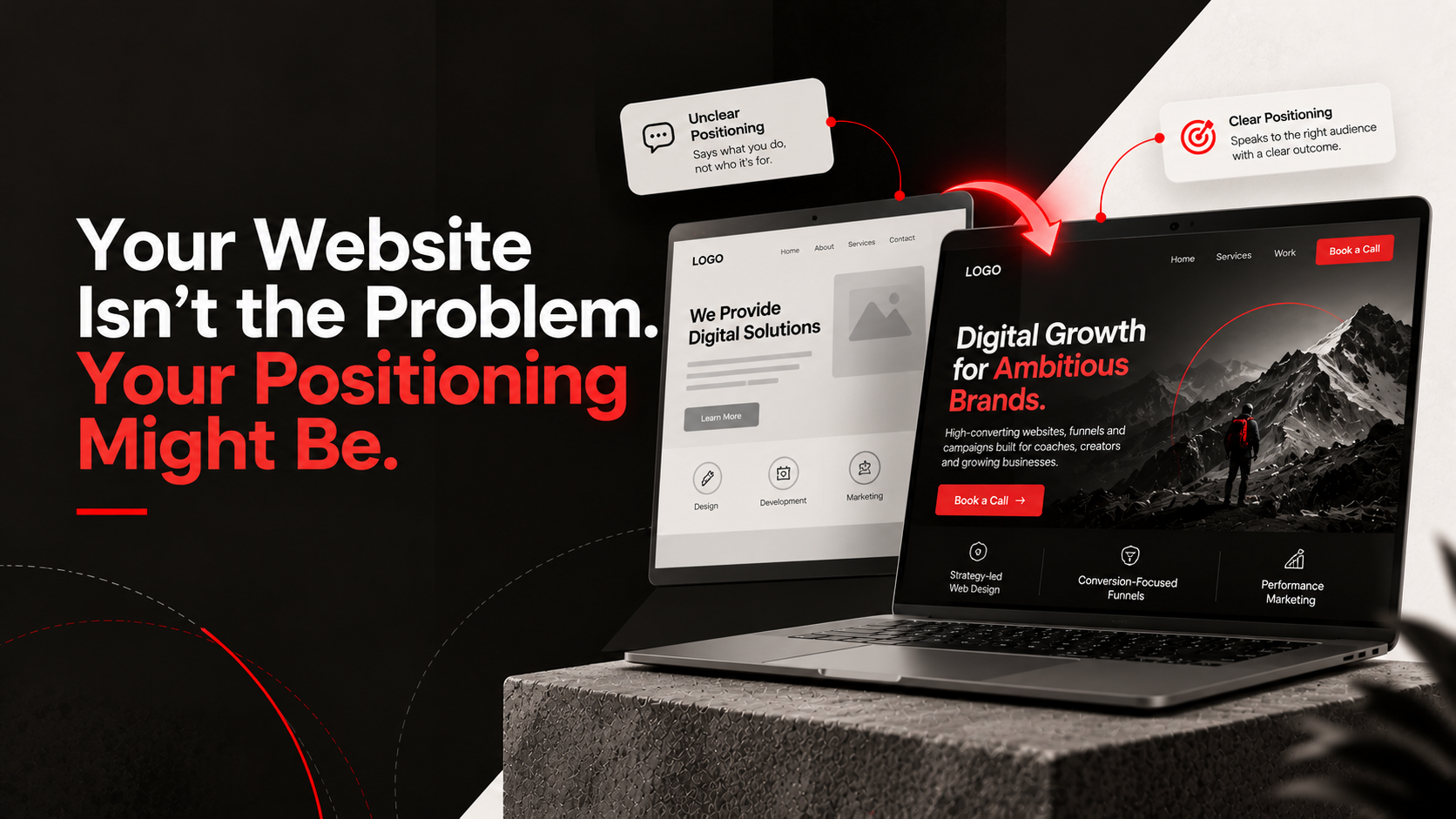
Your Website Isn't the Problem. Your Positioning Might Be.
A beautiful website won't save a confusing brand. Learn why your positioning, messaging, and value proposition matter more than aesthetics.
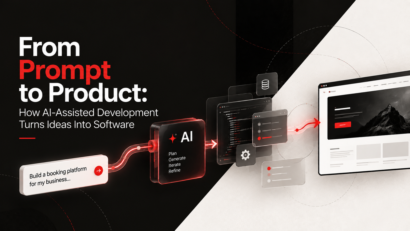
From Prompt to Product: How AI-Assisted Development Turns Ideas Into Software
Learn how modern developers use AI-assisted coding and vibe coding to turn ideas into fully functional software at record speed.
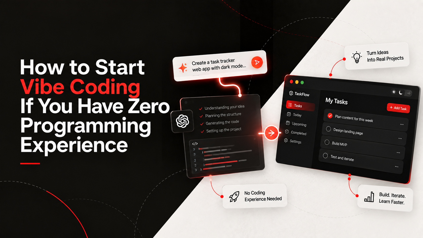
How to Start Vibe Coding If You Have Zero Programming Experience
Want to build apps but don't know how to code? Discover how beginners are using AI assistants and vibe coding to build their first projects.
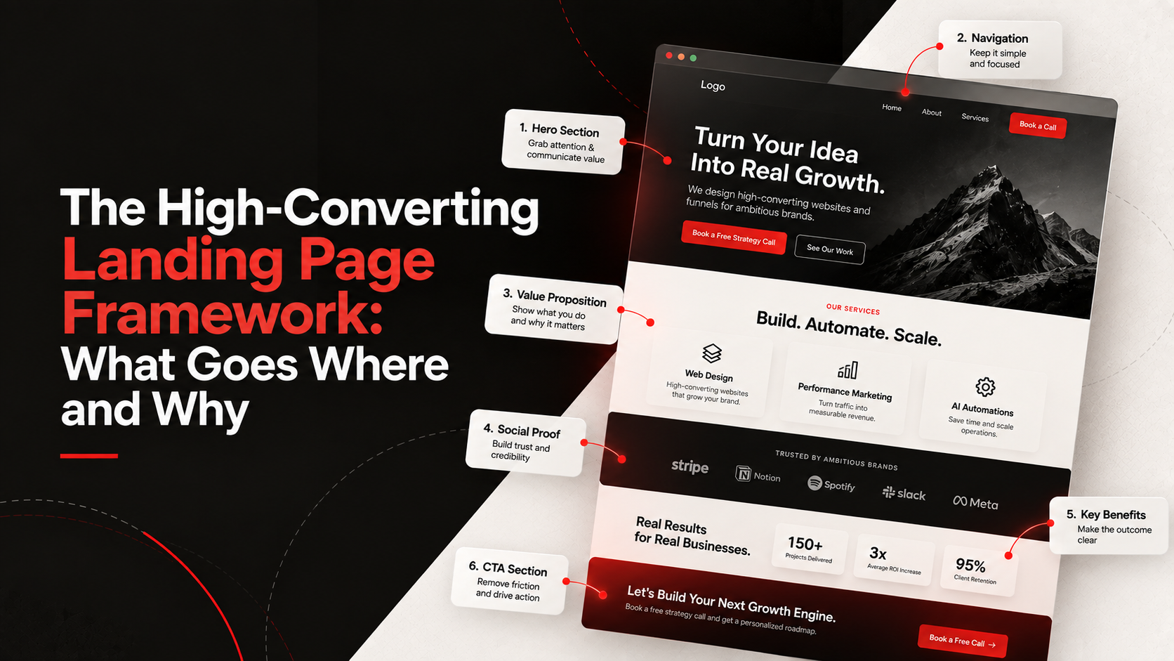
The High-Converting Landing Page Framework: What Goes Where and Why
Stop guessing what to put on your landing pages. Here is the exact structure we use to turn cold traffic into qualified leads.
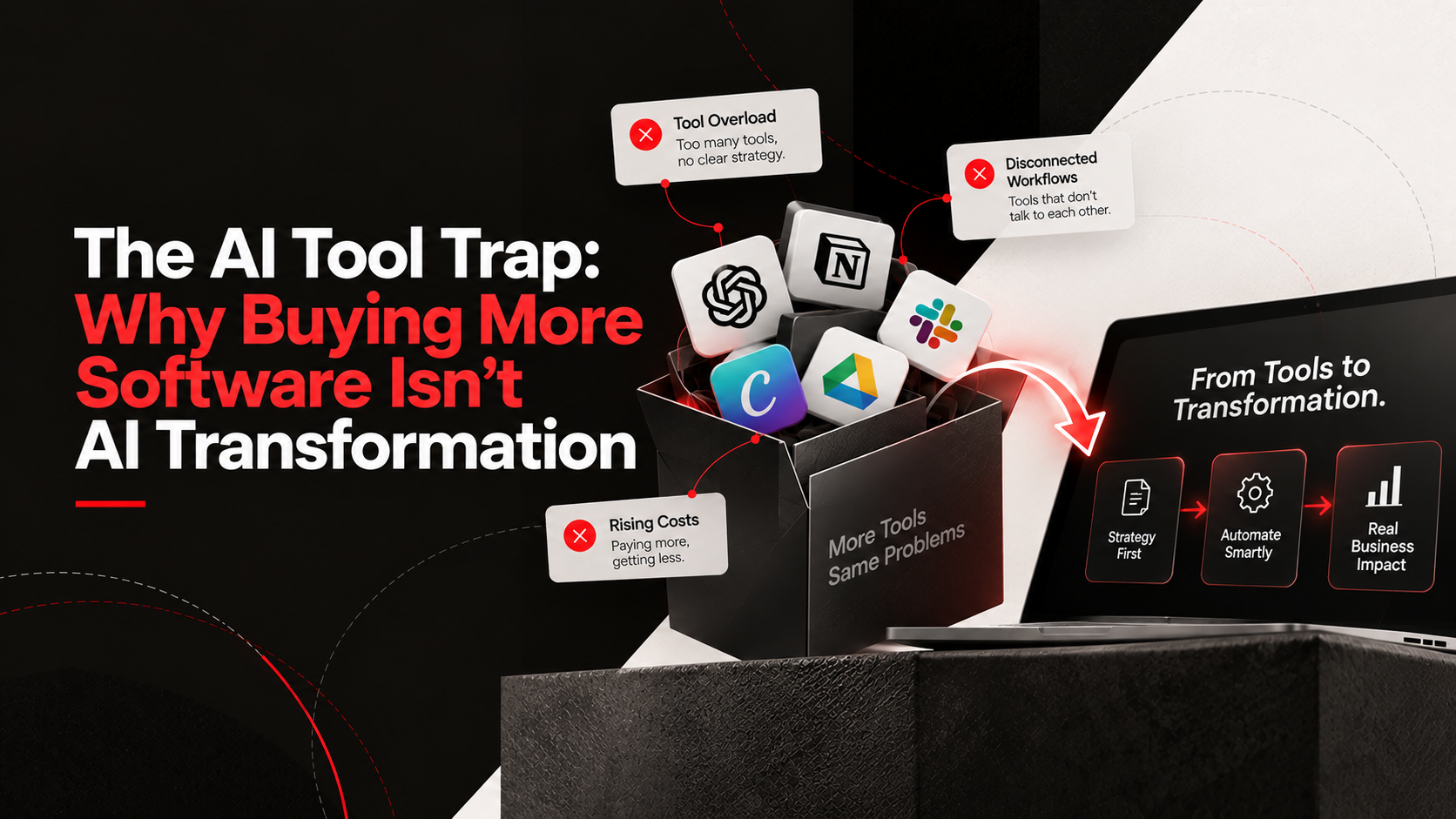
The AI Tool Trap: Why Buying More Software Isn't AI Transformation
Stop buying AI subscriptions you don't need. Learn why real business process automation starts with strategy, not just more software.